Digital & Graphic Design for Business Results
Get results.
Scroll down to see examples of my work.
If you're looking for cheap I'm expensive.
If you're looking for results I'm cheap
The price is the same, the only difference is your perspective
Logos & Branding
Corinium Health & Beauty Spa
Create a consistent logo combining existing logotype with a logomark to build brand awareness across existing marketing channels.
QooxDoo Project
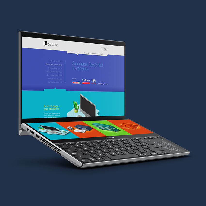
Build a new visual identity to align with the future vision for Qooxdoo and the upcoming release v6.0.
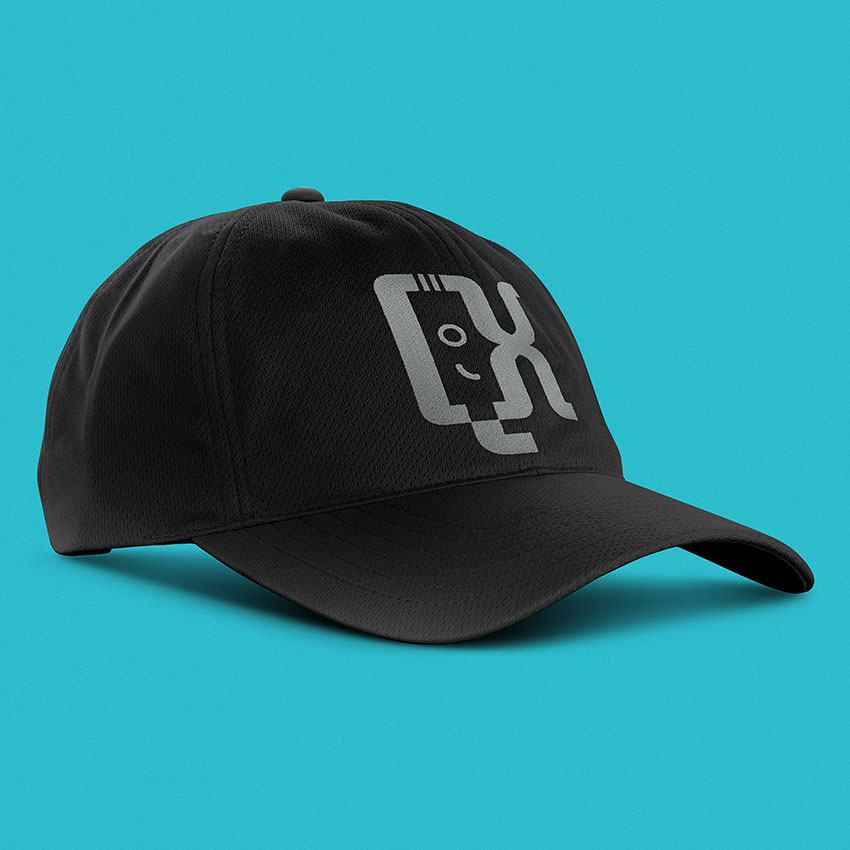
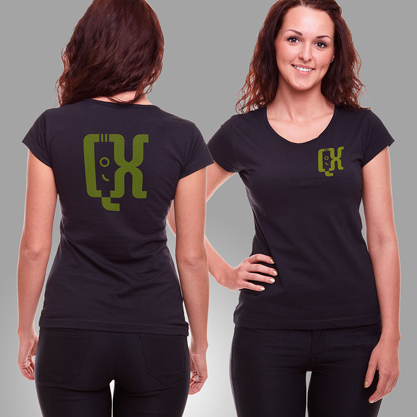
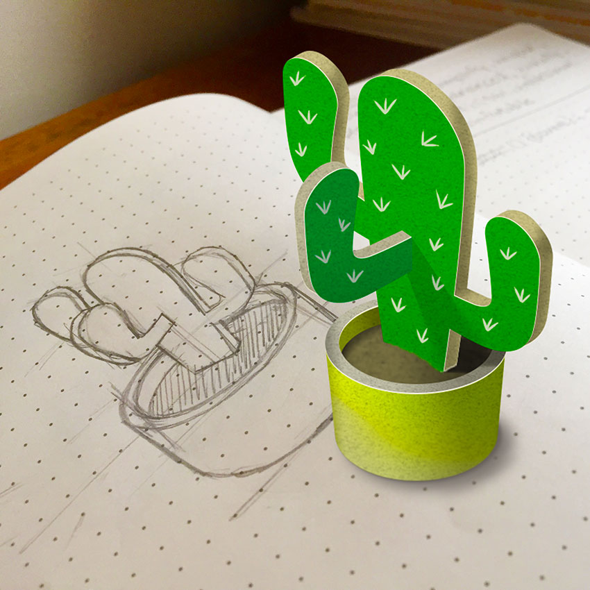
The images here show the final logo, some of the more than 100 sketches produced to arrive at the final logo and words obtained from our discovery session to describe the brand’s personality.
One of the challenges was to find a design that the entire team could get behind. This was achieved by involving them all in the process of iteration and showing them the considered steps and thought process taken to arrive at each solution.
It was also paramount to find out the required touch points and produce mock ups showing the logo in use, on different colour backgrounds and at small sizes. The finished logo uses the represents the letters ‘Q’ and ‘X’, curly braces and brackets used in Javascript and in the negative space the face of a developer.
Once the logo was complete I created a range of isometric illustrations to support each feature as well as a vibrant colour palette to run across all areas of the new website. I translated my Photoshop design into HTML/CSS and passed the files on to Qooxdoo to finish the code and launch.
Fieldhouse Kitchens and Bathrooms
This logomark was created to complement the existing workmark which in turn was fine tuned to fit with the new responsive website and bespoke CMS.
South Gundenham Farm
Create a brand new logo for the farm that doesn't include specific animals or farm products. The logo should be memorable and at the same time reproduce well in print and online.
PowerClean
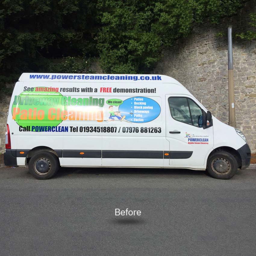
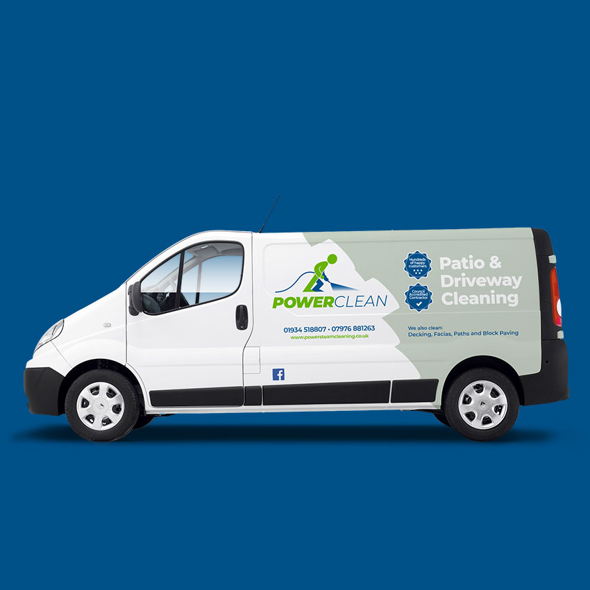
Modernise the visual identity of PowerClean and emphasize the quality of the service on offer.
After a discovery session with the client a clear picture was established of the requirements. I spent time researching and sketching to generate ideas for the logo. This process enables me to move past the obvious solutions and find those which are more visually appealing and unique.
The chosen design replaced the cartoon character they had before with a modern interpretation. The forward slant of the character along with the italic bold font conveys power and the blue/thinner font contrasts and suggests water and cleaned. The shade of green chosen represents moss.
For the van we removed anything that wasn’t important to the design and created a visually simple, professional and clean design with a clear message.
Howard Yarnold Windows & Doors
The logomark combines the H and Y to represent a window and frame. Look closely to see the h + y and how they interact.
Artefact IT
Artefact IT create heritage interactive products. This logo uses an actual artefact you can interact with rather than an illustration.
Design for Print
The Association of Association Executives
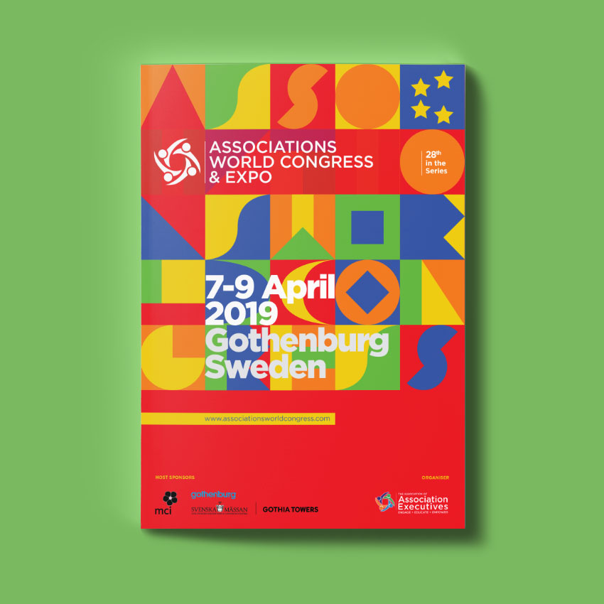
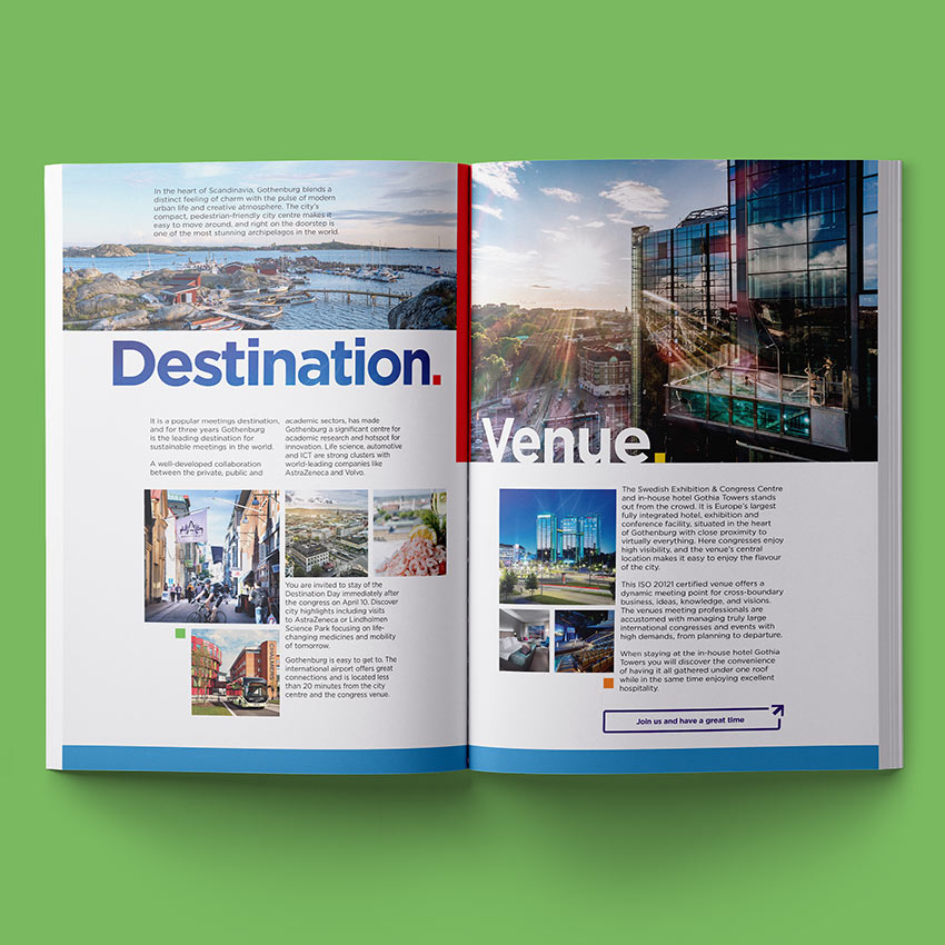
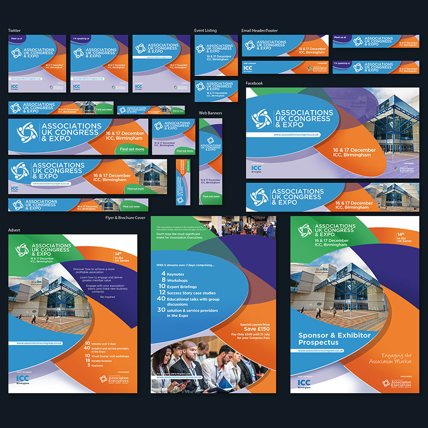
A full range of event marketing materials including brochures, flyers, online and email banners, badges, event signage, posters and more.
The AAE needed somebody able to produce all manner of promotional material both in print and online. My skills suited them very well as did my attention to detail and ability to work on multiple projects and follow brand guidelines, all to strict deadlines.
I worked with AAE as part of their marketing team to design the look and feel of both UK and international events. All work was carried out remotely with meetings held online.
The Association of Association Executives
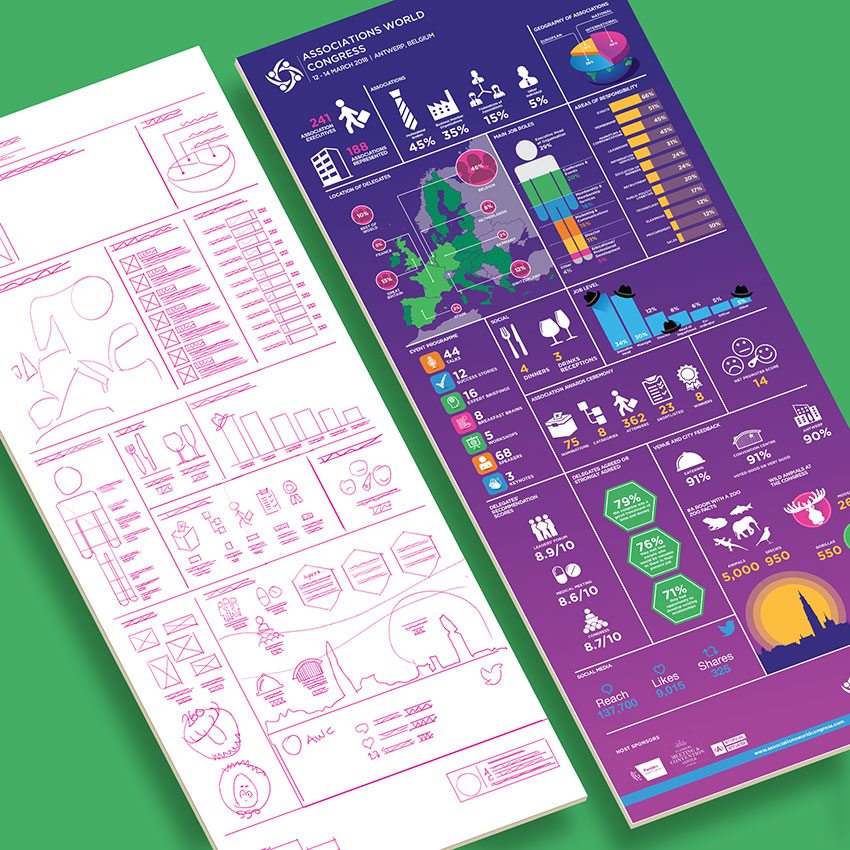
An infographic relating to event success to act as marketing for followup events.
Following the success of the 2018 event and infographic was required as part of the marketing package for the 2020 event to present the success data.
Presented with a spreadsheet of figures I broke them down into clearly defined sections, grouping similar data and ordering the content into an information hierarchy. After analysing the data I created a list of icons and illustrated them using an icon design grid to ensure consistency with size and stroke width. Overall I was mindful to make the data interesting and memorable. The whole infographic was published in both print and digital formats and sizes.
The British Veterinary Nursing Association
A post event social media engagement infographic to inform members about the event success.
IEWC Global Solutions
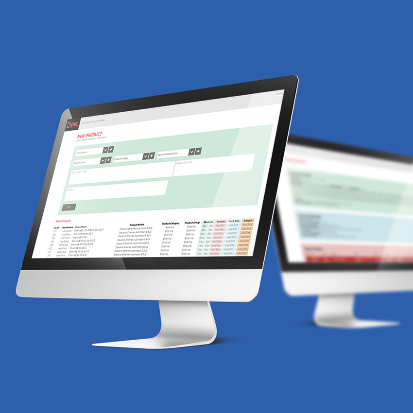
From 6 supplier catalogues, design and produce a single 600 product IEWC EMEA catalogue. In the process, create a database that can be used on the web and updated with minimal training.
Their UK operation approached me to create an EMEA (Europe, Middle East & Africa) catalogue containing 600 products from 8 manufacturers. That meant 8 different manufacturer catalogues to extract product information from. Each manufacturer used varying terminology and layout which caused an issue with consistency across the new catalogue.
To solve this problem I designed a data entry system and database with rules and colour codes to enforce consistency. I tested the system against each catalogue to be sure it worked for all products before designing the database schema and UI. Because of the volume of information to dealt with the system also had to be easy to learn and capable of accepting input simultaneously from multiple users.
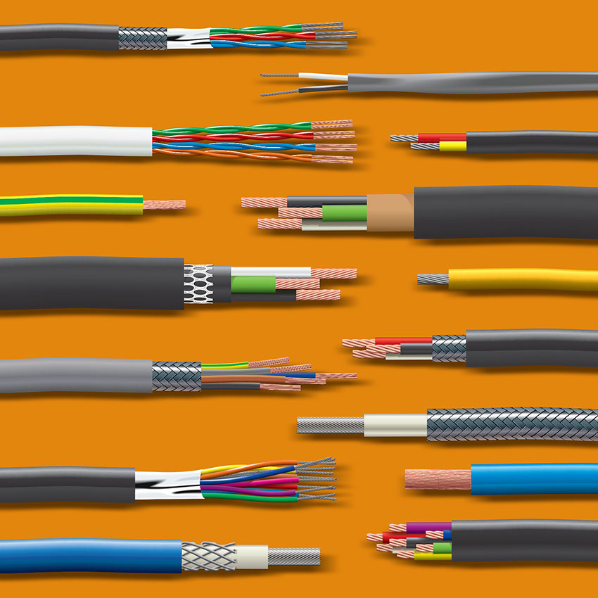
Once complete this data had to be extracted and placed into InDesign. I used third party software to link InDesign directly to the database and wrote database queries for extracting the data for each product. The result can be seen opposite.
Famatel UK
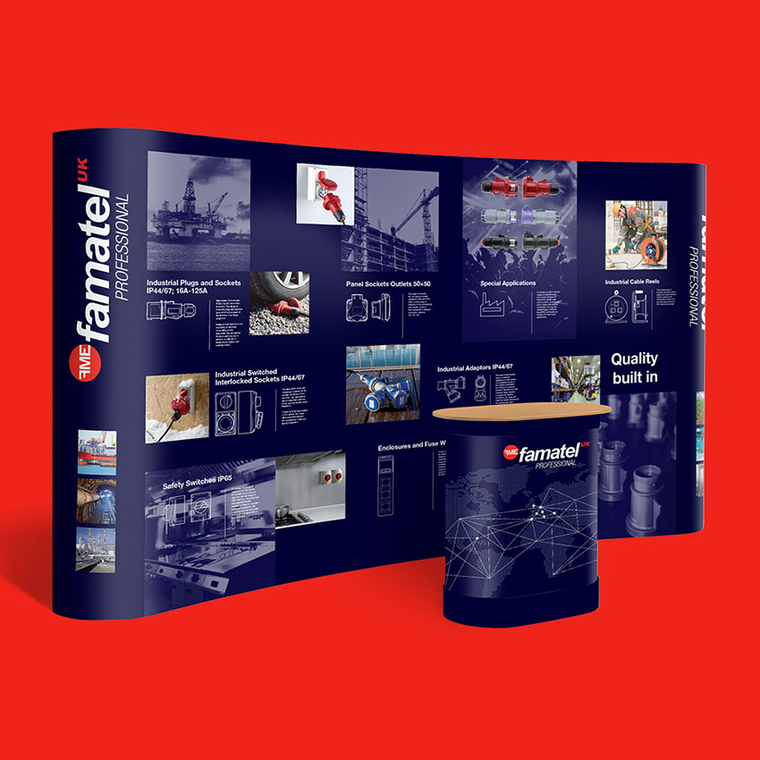
Exhibition stand graphics to provoke engagement from passers by showing the full range of products offered.
When Famatel first approached me they were using advertising material printed in house on a standard printer. At first they wanted me to do design work which would also be output in the same way. this didn’t reflect the parent company’s brand values and in fact cheapened the brand and damaged sales.
I obtained quotations for printing everything they were producing to show that when the cost of consumables and their time was taken into consideration, not to mention the loss of sales from producing sub standard brochures and flyers, it was actually cheaper and quicker to professionally print.
The British Veterinary Nursing Association
A4 poster campaign to find veterinary nursing regional representatives.
Websites, UI & Digital
MTBThere Mountain Bike Holiday App Study
Design a free app to help mountain bikers discover new trails around the UK and find bike friendly accommodation for all group sizes.
Artefact IT - The History of Hook Interactive
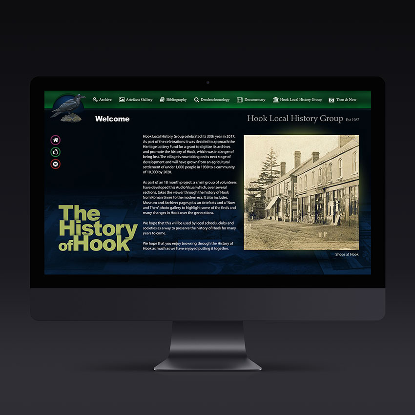
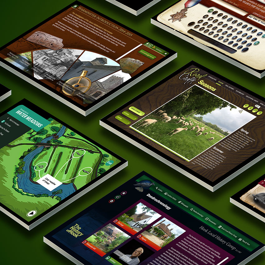
Design and produce an interactive about this small town in Hampshire containing galleries, documentaries, slideshows, articles and documents.
Every job starts with the collating and mapping of content, asking questions about the end user, compatibility requirements, operating system, screen resolution and basic look and feel. Only once a clear overall picture of the requirements has been established can any design be attempted.
One of the challenges is to deliver content in a way that doesn’t require training. Navigation therefore follows established UX laws such as careful grouping of similar elements, fast button click response times, navigation working in an expected way and as few clicks as possible to reach any content.
Famatel UK
A full range of event marketing materials including website, brochures, price lists, flyers, banners, badges, email marketing and more. All material produced follows brand guidelines.
The main image shows a screenshot from the custom Content Management System for producing flyer PDFs for email marketing alongside the website home page.
Dog Walkers UK
Website redesign to create a bespoke, responsive site with a focus on making the site far easier to update than the previous Wordpress site.
Artefact IT
An interactive resource for information relating to life in the village of Dilton Marsh during WW2.
Corinium Health & Beauty Spa
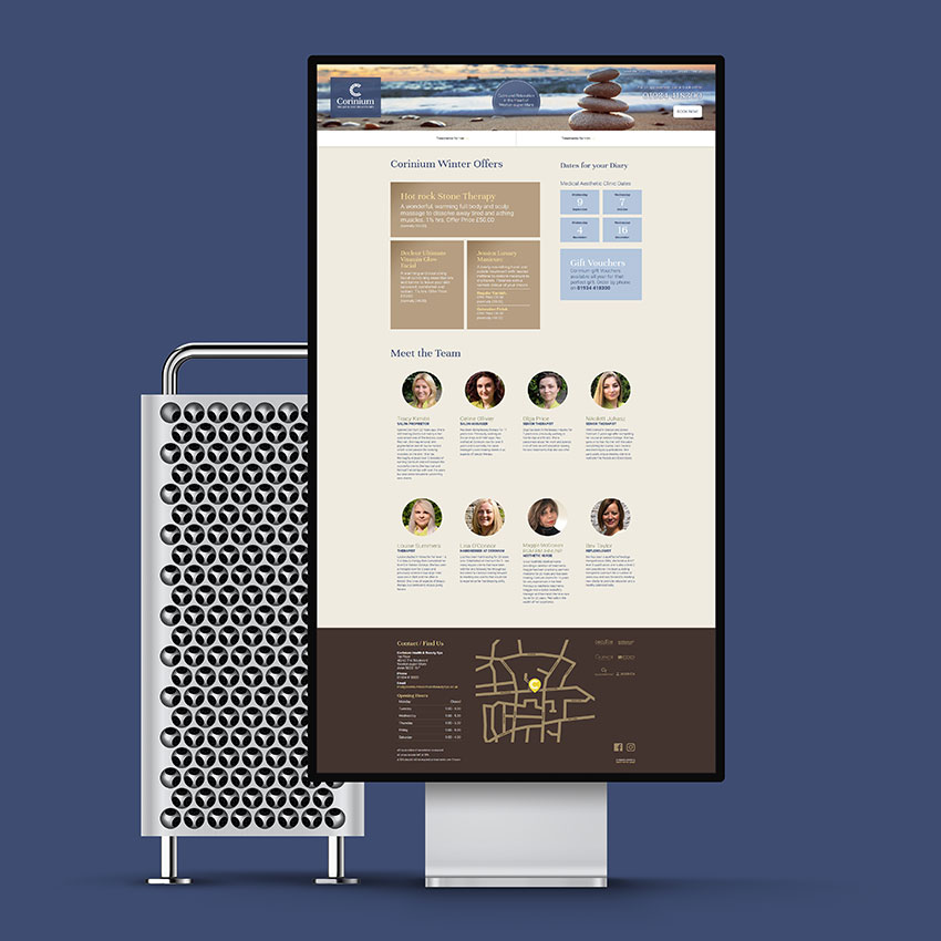
A website redesign primarily to make the website responsive and make the treatment information easier to find and read.
A redesign of their website was long overdue as the website was designed before sites became responsive. Monthly Google Analytics data has shown a significant swing to mobile devices being the most common way to access their website. The new website has presented the perfect opportunity to improve their branding across all touch points with a more consistent look.
At the centre of this was a new logo. Previously only a wordmark existed which was getting lost when presented in the context of a leaflet. Nothing stood out to help with brand recognition as something to build on.
I created a new logomark with a Greek mosaic style coupled with a font with a luxury brand feel.
Once the new logo was established I started to work on a stylescape to reflect the brand attributes. Since the spa is town centre based and didn’t have the benefit of a particularly photogenic building or setting. I decided to focus the tone of the website on ‘how the treatments make you feel’. Corinium: An overall feeling of calm and relaxation with a colour palette taken from the spa interior.
Intentor
One of a series of design alternatives for the redesign of Intentor's website.
Everything Else
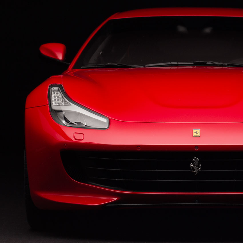
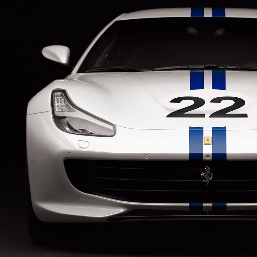
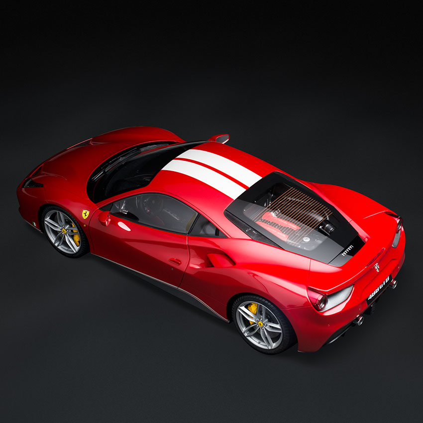
Amalgam Fine Model Cars
Make the red Ferrari on the right look like the real life 70th Anniversary version of the classic Ferrari on the left. Above shot is before and below is after.
In addition to the above work, I carried out the background removal from over 100 models and 450 hours of photo stacking, compositing and dust and scratch removal on hundreds more.
Amalgam Collection have benefitted from my advanced level of Photoshop knowledge to finish their already outstanding photography to the highest possible level. Tasks include dust, scratch and finger print removal, focus stacking, colour correction, background removal and the creation of model variants for their Ferrari Configurator requiring pixel perfect alignment and colours that match exactly the official Ferrari colour options list.
Famatel UK Product Photography
To take photographs of new products coming into the range where existing photographs don't exist.
CSS Battle
I took on the challenge at CSSBattle.dev to test my CSS coding skills against others around the world. As I write this I'm the UK's highest ranked player and 35th of over 105,000 players globally.
